The Problem
As you know in Clinical Chemistry, we are not always writing a major paper but sometimes just preparing a short-report to answer a technical question that we've encounted at work. For shorter papers, journals often have more stringent rules about how many figures you can submit and even sometimes forbid multipanelled figures. In these situations, we might want to cram a little more into your figure than we might otherwise. In a recent submission, I wanted to produce a difference plot of immunoassay results before and after storage but I also wanted to show the distribution of the results using a histogram–but this would have counted as two separate figures.
However, thanks to some fine work by Dean Attali of UBC Department of Statistics where he works with R-legend Jenny Bryan, it is quite easy to add marginal histograms to a Bland Altman (or any other scatter) plot using the ggExtra package.
How To
Let's make some fake data for a Bland Altman plot. Let's pretend that we are measuring the same quantity by immunoassay at baseline and after 1 year of storage at -80 degrees. We'll add some heteroscedastic error and create some apparent degradation of about 20%:
|
1 2 3 4 5 6 7 |
set.seed(10) #make predictable random data baseline <- rlnorm(100, 0, 1) post <- 0.8*baseline + rnorm(100, 0, 0.10*baseline) plot(baseline,post) abline(lm(post ~ baseline)) abline(0, 1, col="red", lty = 2) |

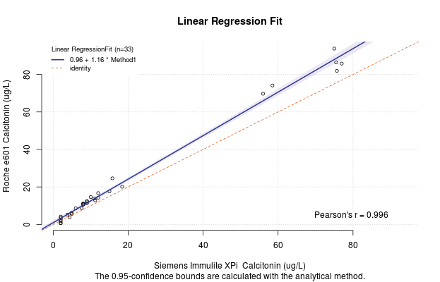
Or if we plot this in the ggplot() paradigm
|
1 2 3 4 5 6 7 8 |
library(ggplot2) my.data <- data.frame(baseline, post) ggplot(my.data, aes(x=baseline, y=post)) + theme_bw() + geom_point(shape=1) + # Use hollow circles geom_smooth(method=lm) + # Add linear regression line geom_abline(slope = 1, intercept = 0, linetype = 2, colour = "red") |

Now we will prepare the difference data:
|
1 2 3 4 5 6 |
diff <- (post - baseline) diffp <- (post - baseline)/baseline*100 sd.diff <- sd(diff) sd.diffp <- sd(diffp) my.data <- data.frame(baseline, post, diff, diffp) |
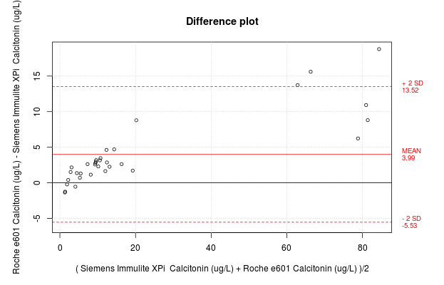
In standard Bland Altman plots, one plots the difference between methods against the average of the methods, but in this case, the x-axis should be the baseline result, because that is the closest thing we have to the truth.
|
1 2 3 4 5 6 7 8 9 10 11 12 13 14 15 16 17 18 |
library(ggExtra) diffplot <- ggplot(my.data, aes(baseline, diff)) + geom_point(size=2, colour = rgb(0,0,0, alpha = 0.5)) + theme_bw() + #when the +/- 2SD lines will fall outside the default plot limits #they need to be pre-stated explicitly to make the histogram line up properly. #Thanks to commenter for noticing this. ylim(mean(my.data$diff) - 3*sd.diff, mean(my.data$diff) + 3*sd.diff) + geom_hline(yintercept = 0, linetype = 3) + geom_hline(yintercept = mean(my.data$diff)) + geom_hline(yintercept = mean(my.data$diff) + 2*sd.diff, linetype = 2) + geom_hline(yintercept = mean(my.data$diff) - 2*sd.diff, linetype = 2) + ylab("Difference pre and post Storage (mg/L)") + xlab("Baseline Concentration (mg/L)") #And now for the magic - we'll use 25 bins ggMarginal(diffplot, type="histogram", bins = 25) |

So that is the difference plot for the absolute difference. We can also obviously do the percent difference.
|
1 2 3 4 5 6 7 8 9 10 11 12 13 |
diffplotp <- ggplot(my.data, aes(baseline, diffp)) + geom_point(size=2, colour = rgb(0,0,0, alpha = 0.5)) + theme_bw() + geom_hline(yintercept = 0, linetype = 3) + geom_hline(yintercept = mean(my.data$diffp)) + geom_hline(yintercept = mean(my.data$diffp) + 2*sd.diffp, linetype = 2) + geom_hline(yintercept = mean(my.data$diffp) - 2*sd.diffp, linetype = 2) + ylab("Difference pre and post Storage (%)") + xlab("Baseline Concentration (mg/L)") ggMarginal(diffplotp, type="histogram", bins = 25) |

Kickin' it Old School
You can also do this in a non-ggplot() paradigm using base plotting utilities as described in this R-bloggers post.
Conclusion
And that, friends, is a way of squishing in a histogram of your sample concentrations into your difference plot which allows you to graphically display your sampling distribution and justify whether you would use parametric or non-parametric statistics to assess the extent of loss of immunoreactivity from storage.
And speaking of scatterplots
“…then the Lord your God will restore your fortunes and have compassion on you and gather you again from all the nations where he scattered you.”
Deut 30:3