Regression Methods
In this post we will be discussing how to perform Passing Bablok and Deming regression in R. Those who work in Clinical Chemistry know that these two approaches are required by the journals in the field. The idiosyncratic affection for these two forms of regression appears to be historical but this is something unlikely to change in my lifetime–hence the need to cover it here.
Along the way, we shall touch on the ways in which Deming and Passing Bablok differ from ordinary least squares (OLS) and from one another.
Creating some random data
Let's start by making some heteroscedastic random data that we can use for regression. We will use the command set.seed() to begin with because by this means, the reader can generate the same random data as the post. This function takes any number you wish as its argument, but if you set the same seed, you will get the same random numbers. We will generate 100 random \(x\) values in the uniform distribution and then an accompanying 100 random \(y\) values with proportional bias, constant bias and random noise that increases with \(x\). I have added a bit of non–linearity because we do see this a fair bit in our work.
|
|
set.seed(20) x <- runif(100,0,100) y <- 1.10*x - 0.001*x^2 + rnorm(100,0,1)*(2 + 0.05*x) + 15 |
The constants I chose are arbitrary. I chose them to produce something resembling a comparison of, say, two automated immunoassays.
Let's quickly produce a scatter plot to see what our data looks like:
|
|
plot(x,y, main = "Regression Comparison", xlab = "Current Method", ylab = "New Method") |

Residuals in OLS
OLS regression minimizes the sum of squared residuals. In the case of OLS, the residual of a point is defined as the vertical distance from that point to the regression line. The regression line is chosen so that the sum of the squares of the residuals in minimal.
OLS regression assumes that there is no error in the \(x\)–axis values and that there is no heteroscedasticity, that is, the scatter of \(y\) is constant. Neither of these assumptions is true in the case of bioanaytical method comparisons. In contrast, for calibration curves in mass–spectrometry, a linear response is plotted as a function of pre–defined calibrator concentration. This means that the \(x\)–axis has very little error and so OLS regression is an appropriate choice (though I doubt that the assumption about homoscedasticity is generally met).
OLS is part of R's base package. We can find the OLS regression line using lm() and we will store the results in the variable lin.reg.
|
|
plot(x,y, main = "Regression Comparison", xlab = "Current Method", ylab = "New Method") lin.reg <- lm(y~x) abline(lin.reg, col="blue") |

Just to demonstrate the point about residuals graphically, the following shows them in vertical red lines.

Deming Regression
Deming regression differs from OLS regression in that it does not make the assumption that the \(x\) values are free of error. It (more or less) defines the residual as the perpendicular distance from a point to its fitted value on the regression line.
Deming regression does not come as part of R's base package but can be performed using the MethComp and mcr packages. In this case, we will use the latter. If not already installed, you must install the mcr package with install.packages("mcr").
Then to perform Deming regression, we will load the mcr library and execute the following using the mcreg() command, storing the output in the variable dem.reg.
|
|
library(mcr) dem.reg <- mcreg(x,y, method.reg = "Deming") |
By performing the str() command on dem.reg, we can see that the regression parameters are stored in the slot @para. Because the authors have used an S4 object as the output of their function, we don't address output as we would in lists (with a $), but rather with an @.
1 2 3 4 5 6 7 8 9 10 11 12 13 14 15 16 17 18 19 20 21 22 23 24 25 26 27 28 29 |
## Formal class 'MCResultResampling' [package "mcr"] with 21 slots ## ..@ glob.coef : num [1:2] 15.58 1.04 ## ..@ glob.sigma : num [1:2] 0.8165 0.0147 ## ..@ xmean : num 46.8 ## ..@ nsamples : int 999 ## ..@ nnested : num 25 ## ..@ B0 : num [1:999] 15.9 15.4 16 16.1 15.6 ... ## ..@ B1 : num [1:999] 1.01 1.04 1.02 1.04 1.03 ... ## ..@ sigmaB0 : num [1:999] 0.794 0.766 0.846 0.815 0.737 ... ## ..@ sigmaB1 : num [1:999] 0.0141 0.0142 0.0155 0.0141 0.0135 ... ## ..@ MX : num [1:999] 46.8 45.9 45.4 48.9 45.5 ... ## ..@ bootcimeth : chr "quantile" ## ..@ rng.seed : num NA ## ..@ rng.kind : chr NA ## ..@ data :'data.frame': 100 obs. of 3 variables: ## .. ..$ sid: Factor w/ 100 levels "S1","S10","S100",..: 1 13 24 35 46 57 68 79 90 2 ... ## .. ..$ x : num [1:100] 87.8 76.9 27.9 52.9 96.3 ... ## .. ..$ y : num [1:100] 110.8 93.5 45.6 76.6 116.6 ... ## ..@ para : num [1:2, 1:4] 15.58 1.04 NA NA 14.45 ... ## .. ..- attr(*, "dimnames")=List of 2 ## .. .. ..$ : chr [1:2] "Intercept" "Slope" ## .. .. ..$ : chr [1:4] "EST" "SE" "LCI" "UCI" ## ..@ mnames : chr [1:2] "Method1" "Method2" ## ..@ regmeth : chr "Deming" ## ..@ cimeth : chr "bootstrap" ## ..@ error.ratio: num 1 ## ..@ alpha : num 0.05 ## ..@ weight : Named num [1:100] 1 1 1 1 1 1 1 1 1 1 ... ## .. ..- attr(*, "names")= chr [1:100] "S1" "S2" "S3" "S4" ... |
|
|
## EST SE LCI UCI ## Intercept 15.57790 NA 14.446677 16.810321 ## Slope 1.03658 NA 1.006434 1.066066 |
The intercept and slope are stored in demreg@para[1] and dem.reg@para[2] respectively. Therefore, we can add the regression line as follows:
|
|
plot(x,y, main = "Regression Comparison", xlab = "Current Method", ylab = "New Method") abline(dem.reg@para[1:2], col = "blue") |

To emphasize how the residuals are different from OLS we can plot them as before:

We present the figure above for instructional purposes only. The usual way to present a residuals plot is to show the same picture rotated until the line is horizontal–this is a slight simplification but is essentially what is happening:

Ratio of Variances
It is important to mention that if one knows that the \(x\)–axis method is subject to a different amount of random analytical variability than the \(y\)–axis method, one should provide the ratio of the variances of the two methods to mcreg(). In general, this requires us to have “CV” data from precision studies already available. Another approach is to perform every analysis in duplicate by both methods and use the data to estimate this ratio.
If the methods happen to have similar CVs throughout the analytical range, the default value of 1 is assumed. But suppose that the ratio of the CVs of the \(x\) axis method to the \(y\)–axis method was 1.2, we could provide this in the regression call by setting the error.ratio parameter. The resulting regression parameters will be slightly different.
|
|
mcreg(x,y, method.reg = "Deming", error.ratio = 1.2)@para |
|
|
## EST SE LCI UCI ## Intercept 15.534921 NA 14.39904 16.777065 ## Slope 1.037499 NA 1.00792 1.067316 |
Weighting
In the case of heteroscedastic data, it would be customary to weight the regression which in the case of the mcr package is weighted as \(1/x^2\). This means that having 0's in your \(x\)–data will cause the calculation to “crump”. In any case, if we wanted weighted regression parameters we would make the call:
|
|
w.dem.reg <- mcreg(x,y, method.reg = "WDeming") |
|
|
## The global.sigma is calculated with Linnet's method |
|
|
## EST SE LCI UCI ## Intercept 13.788450 NA 12.858803 14.861006 ## Slope 1.088119 NA 1.058042 1.116879 |
And plotting both on the same figure:
|
|
plot(x,y, main = "Regression Comparison", xlab = "Current Method", ylab = "New Method") abline(dem.reg@para[1:2], col = "blue") abline(w.dem.reg@para[1:2], col = "green") legend("topleft", c("Deming","Weighted Deming"), lty=c(1,1), col = c("blue","green")) |

Passing Bablok
Passing Bablok regression is not performed by the minimization of residuals. Rather, all possible pairs of \(x\)–\(y\) points are determined and slopes are calculated using each pair of points. Work–arounds are undertaken for pairs of points that generate infinite slopes and other peculiarities. In any case, the median of the \(\frac{N(N-1)}{2!}\) possible slopes becomes the final slope estimate and the corresponding intercept can be calculated. With regards to weighted Passing Bablok regression, I’d like to acknowledge commenter glen_b for bringing to my attention that there is a paradigm for calculating the weighted median of pairwise slopes. See the comment section for a discussion.
Passing Bablok regression takes a lot of computational time as the number of points grows, so expect some delays on data sets larger than \(N=100\) if you are using an ordinary computer. To get the Passing Bablok regression equation, we just change the method.reg parameter:
|
|
PB.reg <- mcreg(x,y, method.reg = "PaBa") PB.reg@para |
|
|
## EST SE LCI UCI ## Intercept 14.684463 NA 13.648554 16.495846 ## Slope 1.046021 NA 1.015893 1.075632 |
and the procedures to plot this regression are identical. The mcreg() function does have an option for Passing Bablok regression on large data sets. See the instructions by typing help("mcreg") in the R terminal.
Outlier Effects
As a consequence of the means by which the slope is determined, the Passing Bablok method is relatively resistant to the effect of outlier(s) as compared to OLS and Deming. To demonstrate this, we can add on outlier to some data scattered about the line \(y=x\) and show how all three methods are affected.
|
|
x <- 1:20 y <- c(1:19,10) + rnorm(20,0,0.5) |

Because of this outlier, the OLS slope drops to 0.84, the Deming slope to 0.91, while the Passing Bablok is much better off at 0.99.
Generating a Pretty Plot
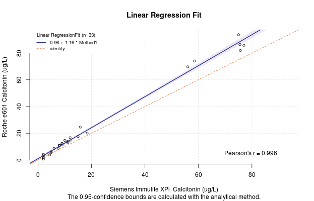
The code authors of the mcr package have created a feature such that if you put the regression model inside the plot function, you can quickly generate a figure for yourself that has all the required information on it. For example,

But this method of out–of–the–box figure is not very customizable and you may want it to appear differently for your publication. Never fear. There is a solution. The MCResult.plot() function offers complete customization of the figure so that you can show it exactly as you wish for your publication.
|
|
MCResult.plot(PB.reg, equal.axis = TRUE, x.lab = "x method", y.lab = "y method", points.col = "#FF7F5060", points.pch = 19, ci.area = TRUE, ci.area.col = "#0000FF50", main = "My Passing Bablok Regression", sub = "", add.grid = FALSE, points.cex = 1) |

In this example, I have created semi–transparent “darkorchid4” (hex = #68228B) points and a semi–transparent blue (hex = #0000FF) confidence band of the regression. Maybe darkorchid would not be my first choice for a publication after all, but it demonstrates the customization. Additionally, I have suppressed my least favourite features of the default plot method. Specifically, the sub="" term removes the sentence at the bottom margin and the add.grid = FALSE prevents the grid from being plotted. Enter help(MCResult.plot) for the complete low–down on customization.
Conclusion
We have seen how to perform Deming and Passing Bablok regression in the R programming language and have touched on how the methods differ “under the hood”. We have used the mcr to perform the regressions and have shown how you can beautify your plot.
The reader should have a look at the rlm() function in the MASS package and the rq() function in the quantreg package to see other robust (outlier–resistant) regression approaches. A good tutorial can be found here
I hope that makes it easy for you.
-Dan
May all your paths (and regressions) be straight:
Trust in the Lord with all your heart
and lean not on your own understanding;
in all your ways submit to him,
and he will make your paths straight.
Proverbs 3:5-6